
Your Homepage Checklist: What Every Small Business Website Needs
If your homepage were a first date, would it get a second one? Or would visitors ghost you faster than a bad Tinder match? A well-designed homepage is the digital storefront of your small business website, and if it’s not pulling its weight, you’re leaving money on the table (or worse, handing it to your competitors).
So, let’s break down the must-haves that will keep your visitors engaged, impressed, and most importantly, ready to do business with you.
1. A Headline That Grabs Attention (and Doesn’t Let Go)
Your headline is your homepage’s first impression. Studies show that visitors take just 0.05 seconds to form an opinion about your site. If your headline doesn’t immediately tell them what you do and why it matters, they’ll bounce faster than a rubber ball.
Your headline should naturally include relevant keywords without sounding forced. Think of it as the perfect mix of branding, copywriting, and SEO... concise but impactful.
✅ Example: Ellevest is a great example of a homepage that isn't afraid of being direct. No need to decode their message to find out what they do. They're compelling, intentional, and establish credibility by mentioning that they're "the experts."

2. A Subheadline That Seals the Deal
Your subheadline should support your main headline and add a bit more detail. Think of it as the friendly wingman that makes sure your headline doesn’t fumble the conversation.
A well-crafted subheadline increases engagement by reinforcing your value proposition and giving visitors a reason to keep scrolling. It’s also a great place to integrate secondary keywords naturally.
✅ Example: Let’s look at Ellevest again as an example of how they expand on their main headline. They provide more detail about what they do: “wealth management” and “financial planning.” They highlight their specific niche: “women.” And they tie it all together with their main selling point: “personalized for you.”
3. A Clear and Irresistible Call-to-Action (CTA)
A CTA isn’t just a button—it’s your homepage’s MVP. Studies show that a clear, well-placed CTA can boost conversions by 121%. Whether it’s “Book a Free Consultation” or “Get a Quote,” make sure it’s clear, visible, and action-oriented.
✅ Pro Tip: Your CTA should stand out. Use a contrasting color and keep it above the fold (meaning, visible without scrolling). Also, use action-driven words like "Start," "Get," or "Schedule" for better engagement.
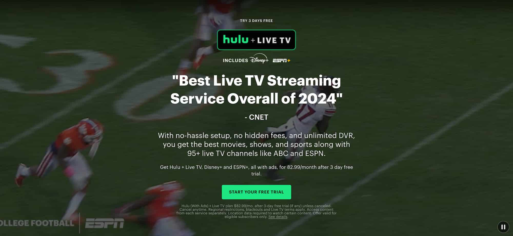
✅ Example: A great example of an effective CTA is Hulu’s. Their bright green button, inviting visitors to “Start Your Free Trial,” stands out against the video playing in the background, instantly drawing attention and making it the most eye-catching element on the screen.
4. An Eye-Catching Supporting Image
Your hero section—the first thing people see—should include your headline, subheadline, CTA, and an eye-catching image or background. If possible, use an image that conveys success or happiness (like a satisfied customer, not a random stock photo of a guy awkwardly shaking hands).
✅ Bonus Points: If you’ve got a video, even better. Video increases engagement like caffeine increases productivity. Websites with video on their homepage can boost conversions by up to 80%.
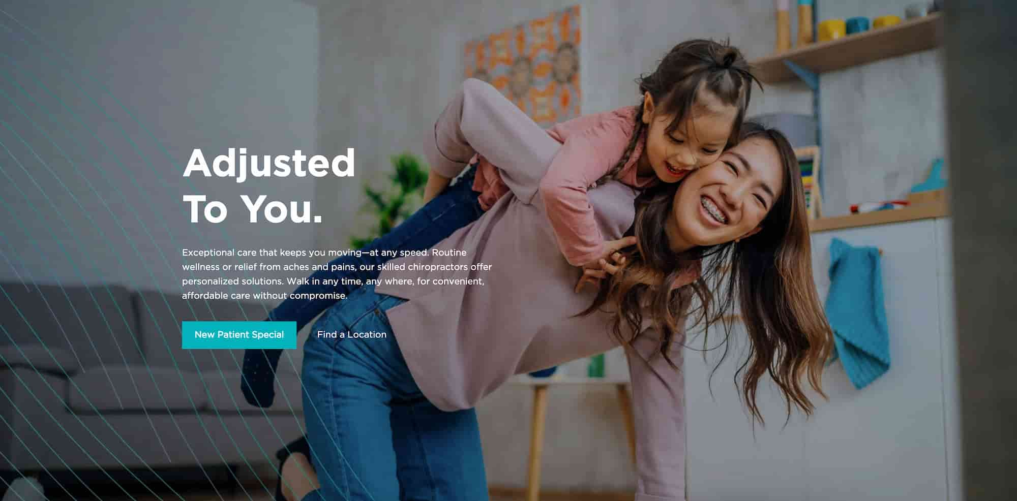
✅ Example: Take a look at this example from The Joint Chiropractic, a great example of an emotionally compelling hero section featuring an image of a woman playing with her child. This visual immediately conveys warmth, care, and the joy of a pain-free life, helping visitors emotionally connect with the service being offered. It reinforces the deeper impact of chiropractic care, not just as pain relief but as a way to restore mobility, improve well-being, and get back to enjoying life’s precious moments.
5. Mobile-Friendly Design (Because Everyone’s on Their Phone)
Over 60% of web traffic comes from mobile devices. If your homepage isn’t mobile-friendly, you might as well be handing customers a flip phone and expecting them to browse.
✅ Test it! Open your site on a phone and see if everything loads properly. If buttons are too small or text gets cut off, fix it ASAP. Google also prioritizes mobile-friendly websites in search rankings, so this is a must for SEO.
6. Social Proof: Show ‘Em You’re Legit
People trust people. 92% of consumers read online reviews before making a decision. Add testimonials, client logos, reviews, or any form of social proof to show visitors that others have trusted you—and loved the results.
✅ Pro tip: If you have impressive statistics, such as the number of happy reviews, users, or notable clients, showcase them in your hero section to build credibility instantly and encourage visitors to keep scrolling.
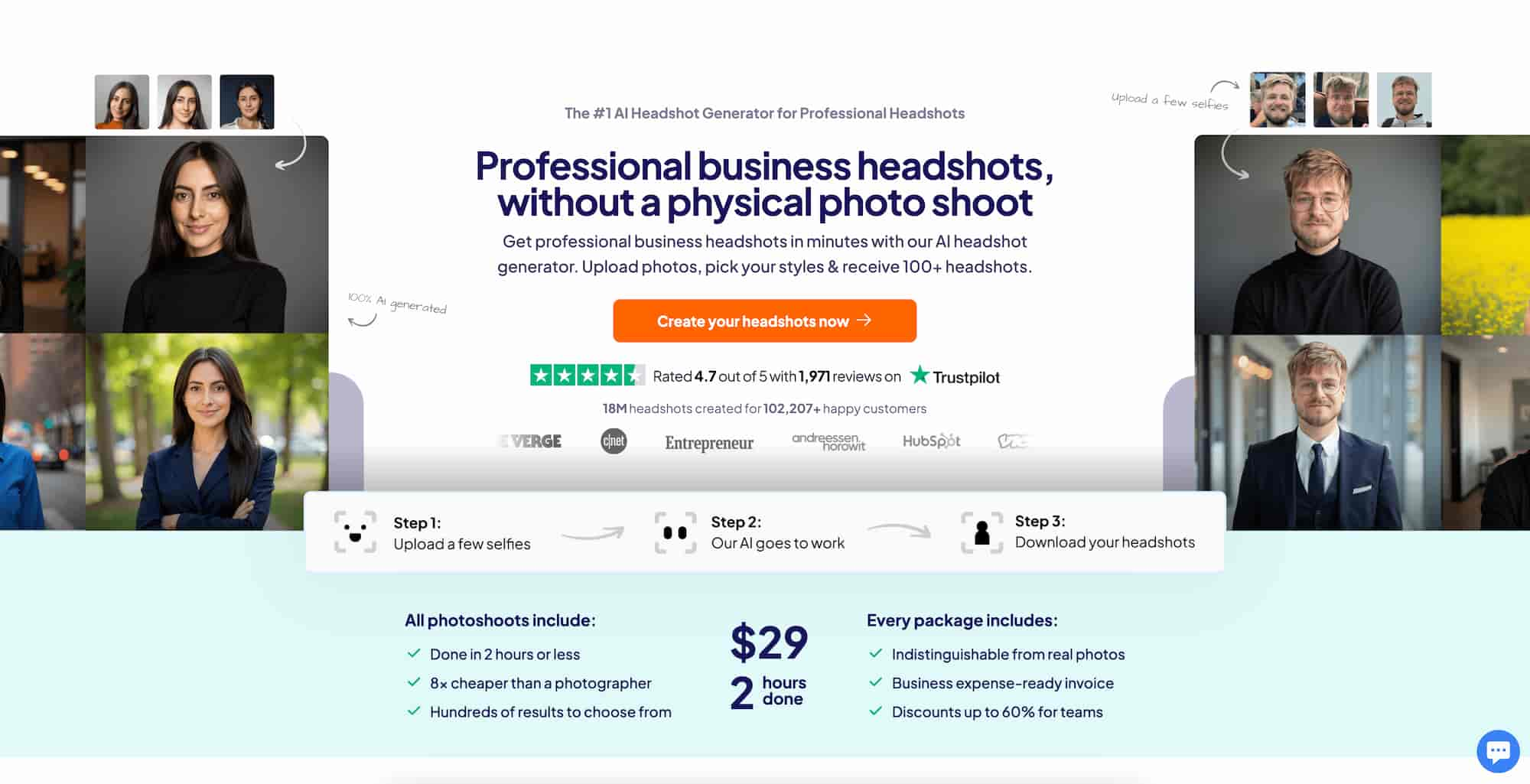
✅ Example: Headshots Pro does an excellent job of establishing credibility right away in their hero section. Below their CTA button, they highlight their 4.7 out of 5-star rating with 1,971 reviews on Trustpilot, a well-known and trusted source. They reinforce this with a statistic of 18 million headshots for over 102,207 happy customers, along with a carousel of logos from reputable companies and brands. While this is a larger business, small businesses can do the same, even with smaller numbers and lesser-known brands. Simply showcasing statistics to support your credibility will set you apart from the competition.
7. A Simple and Logical Navigation Menu
Your navigation menu should be easy to use and help visitors find what they need fast. Confusing navigation can cause 38% of visitors to leave a site immediately. Keep it simple—no one needs 12 menu items.
✅ A few tips:
- Stop using hamburger menus on large screens. Of course, hamburger menus are optimal for mobile devices, but many websites are trying to be "minimalistic" by using hamburger menus on laptop and desktop screens. You're just giving your visitor more work by hiding the navigation behind a burger button.
- Make sure to add the "home" navigation link. Not everyone is tech savvy enough to know that your logo on the top left corner also acts as a home button. Add the home link as the first navigation link so that all of your visitors know how to get back to the homepage.
- Limit menu items. Keep it concise and simple. Nobody wants to be overwhelmed when they enter a website. Studies show that the optimal number of links for a menu is 7 or less.
- Add a CTA button. If there’s a page you want your visitors to see or an action you want them to take, include a prominent CTA button that stands out from the other links. This becomes even more effective if you have a sticky menu, as it allows users to click the CTA button at any point during their journey, keeping it accessible as they scroll.
8. Benefits Section: What Can You Do for the Visitor?
Visitors land on your site with one question in mind: what’s in it for them? A well-crafted benefits section answers that question clearly and persuasively. Instead of just listing features, highlight the real value your product or service provides. Show how you solve their problems, make their lives easier, or help them achieve their goals.
✅ Pro tip: Focus on outcomes, not just offerings. Instead of saying, “We offer 24/7 support,” say, “Get peace of mind with round-the-clock expert support whenever you need it.”
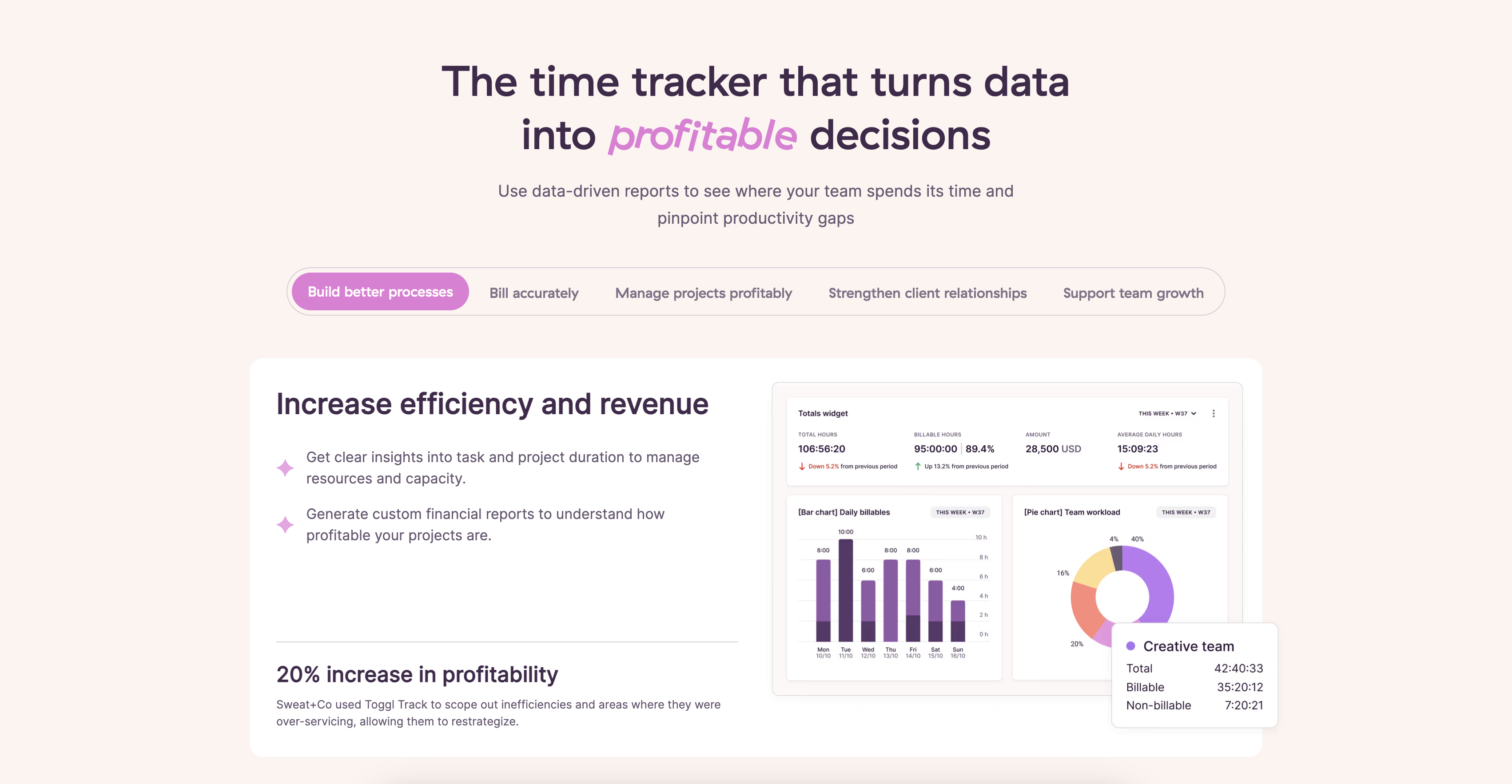
✅ Example: Toggl, a time tracking app, offers a great example of a well-crafted benefits section. It clearly communicates how their service improves the customer’s life and business by increasing efficiency, revenue, accuracy, and supporting business and relationship growth. Notice how this section focuses on what the customer gets for using their service.
9. Features Section: How Do You Deliver Results?
While your benefits section answers the question, “What’s in it for me?” your features section dives into the specifics of how you deliver on those promises. Benefits focus on the outcomes visitors can expect, while features highlight the details of your product or service that make those outcomes possible.
It’s important to place the features section after the benefits. Visitors need to understand what you can do for them first before learning how you do it. The benefits generate excitement, while the features provide the concrete details that support those claims.
✅ Pro tip: Keep the features section concise and easy to skim. Use bullet points or icons to break things up and help visitors quickly understand the value behind each feature.
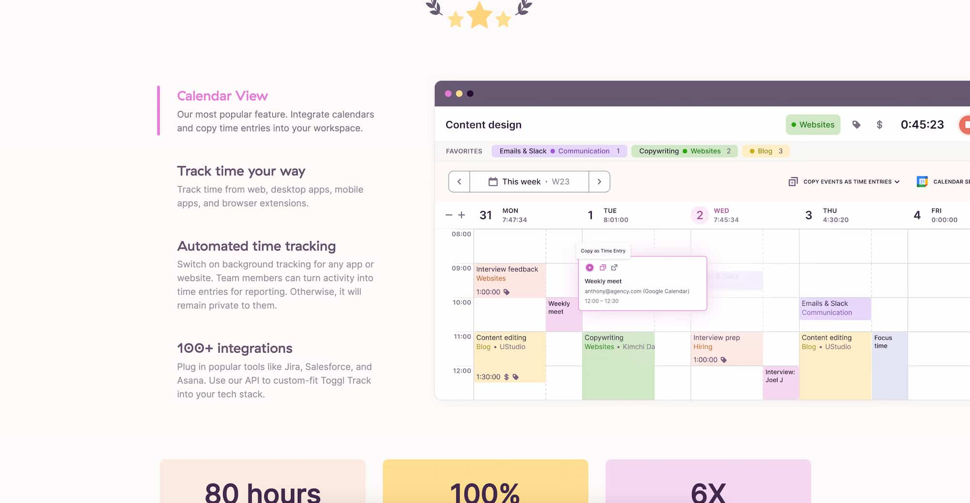
✅ Example: Let’s take another look at the Toggl website. This is where they highlight their features, focusing on what their app offers. Each feature plays a key role in delivering the benefits mentioned earlier, showing exactly how their service helps users achieve their goals.
10. An SEO-Friendly Footer (Because Google Cares)
Your footer is prime real estate. Add important links, a short business bio, and maybe a small CTA.
✅ Footer Checklist:
- Business name and logo
- Quick links (Privacy Policy, Terms, etc.)
- Contact info
- Social media links
- A mini CTA (e.g., “Let’s build something great—contact us today!”)
✅ Pro Tip: Adding your business address and local SEO keywords in the footer can improve your local search rankings.
11. Fast Load Speed (Because No One Likes Waiting)
A slow site is a dead site. 40% of visitors will leave if a site takes more than 3 seconds to load. Optimize your homepage by compressing images, using caching, and avoiding unnecessary scripts that slow things down.
✅ Test it! Use tools like Google PageSpeed Insights to check your site speed.
✅ Pro Tip: Use next-gen image formats like WebP instead of JPEGs to improve loading speed without sacrificing quality.
Final Thoughts
Your homepage isn’t just a pretty digital business card—it’s a powerhouse for conversions. Nail these essentials, and you’ll have a website design that not only looks good but works hard to grow your business. While many of the examples I provided are larger companies, all of these tips can easily be implemented by small businesses too. You're website deserves the same love and attention as the big guys, don't forget that.
Of course, this is just the tip of the iceberg. Every webpage is different, and every brand has unique needs. Need help getting your homepage up to par? Let’s talk, because a homepage that converts leads to a thriving business.
Want to see some of these best practices in action? Check out my homepage at https://fourthcrownwebdesigns.com


